How to Optimize Your Website’s Navigation for Better User Experience and SEO
Your website’s navigation might seem like a small design element, but it plays a major role in how users interact with your content and how search engines crawl your site. For small business website owners, especially those using WordPress, an intuitive navigation structure can mean the difference between a visitor sticking around or bouncing off within seconds. Moreover, well-organized menus and page hierarchies help boost your SEO rankings by making it easier for Google to understand and index your content.
This guide will walk you through why navigation matters, how to structure it effectively, what to avoid and how mobile and desktop strategies differ. All with practical, easy-to-implement advice.
Why Website Navigation Matters for UX and SEO
User Experience (UX): Visitors come to your site with a goal—whether it’s learning more about your services, reading your blog or contacting you. A smooth, logical navigation structure helps them find what they need quickly, without getting frustrated.
When navigation is poor, users are more likely to leave the site altogether, which can cost more than you think it is.
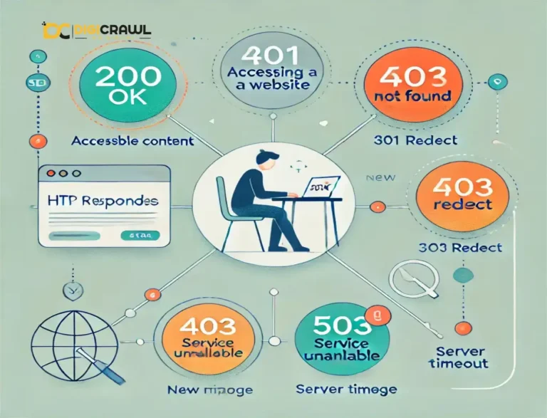
Search Engine Optimization (SEO): Search engines, such as Google, use navigation to discover and index web pages. Clear menus and internal linking structures tell search engines which pages are most important, how content is related and how deep users have to dig to find valuable information.
A well-optimized navigation menu increases crawlability and boosts the visibility of key pages.
Best Practices for Structuring Menus and Organizing Pages
A thoughtful website structure begins with logical grouping and prioritization. Here’s how to get it right:
1. Use a Clear Hierarchical Structure
Start with top-level categories and break them into relevant subcategories. For instance take an example of our website:
- Home
- SEO Services
- SEO Services in Islamabad
- SEO Services in Pakistan
- SEO Services in Adelaide
- Digital Marketing
- TikTok Marketing Agency
- Digital Marketing in Lahore
- Web Development
- PPC
- PPC Experts in Pakistan
- PPC Experts in Dubai
- Contact Us
- Case Studies
- Google Updates
- Blog
This hierarchy gives both users and search engines a roadmap of your content.
2. Limit Top-Level Menu Items
Keep your primary navigation menu focused, ideally between 5 to 7 top-level links. Too many choices overwhelm users and dilute SEO equity. Additional information can be nested under dropdown menus or moved to the footer navigation.
3. Use Descriptive, Keyword-Rich Labels
Avoid vague terms like “What We Do” or “Stuff.” Instead, use clear, targeted phrases like “Digital Marketing Services in Islamabad” to convey exactly what the page contains. This not only helps users but also aligns with SEO best practices by reinforcing your keyword strategy.
4. Make Navigation Consistent Across Pages
Ensure your navigation bar appears the same on all pages of your site. Consistency builds trust and helps users develop mental models of your site’s structure, making repeat visits smoother and more intuitive.
Common Navigation Mistakes to Avoid
Even well-designed sites can be tripped up by poor navigation decisions. Here are the top pitfalls to sidestep:
1. Overcrowded Menus
Trying to cram every possible link into your main menu is a common misstep. It clutters the interface and dilutes focus.
Prioritize the pages that support your business goals, and move less-critical links to the footer or submenus.
2. Unclear or Jargon-Filled Labels
Your menu should speak the user’s language, not internal company terminology. A potential customer is more likely to click “Security companies in Adelaide” than “Solutions Suite.”
Stick with labels that are intuitive, descriptive and action-oriented.
3. Lack of Visual Hierarchy
All links shouldn’t look the same. Use visual cues such as font size, color, or spacing to indicate the relationship between parent and child menu items. Without visual hierarchy, even the most logical structure confuses the user.
4. Broken or Hidden Links
Make sure all navigation links are functional and that key pages aren’t invisible too deep within the site. Incorporate internal links throughout your content.
For example, linking to a service page from a blog post, to reinforce site structure and improve SEO.
Mobile vs Desktop Navigation: A Brief Comparison
Today’s users are just more likely to visit your site on a mobile device than on a desktop. This behaviour makes responsive navigation design a must.
Mobile Navigation
- Hamburger Menus: These three-line icons hide the menu until clicked, saving space and decluttering the screen.
- Sticky Menus: Keeping your menu at the top as users scroll makes it easier to navigate on small screens.
- Prioritized Links: It’s the limit of what appears upfront on mobile. Focus on essentials like Home, Services and Contact to make it clear to the user and crawler.
Desktop Navigation
- Horizontal Menus: These are spread across the top of the page and allow more visibility of all primary links on the website.
- Dropdowns and Mega Menus: Larger displays allow for multi-level navigation to appear instantly when hovered over.
- Hover Effects: Hover animations help users explore subcategories with ease on desktop.
When you’re designing your site in WordPress, use responsive themes and preview your navigation on different devices. Plugins like “WP Mobile Menu” or “Max Mega Menu” can also help optimize navigation for both platforms.
Actionable Tips for Better Navigation
Let’s break down some practical ways you can immediately improve your site’s navigation using WordPress:
1. Use WordPress Menus Strategically
Navigate to Appearance > Menus in your WordPress dashboard. Create separate menus for your header, footer and mobile display if needed. Align them based on your theme’s available menu locations.
2. Group Similar Pages into Sub-menus
If you have multiple services, don’t list them all at the top. Use dropdown menus to organize them under a common parent like “Services.”
This helps streamline the layout and supports SEO with internal grouping.
3. Include Internal Links in Content
Pages and blog posts should naturally link to one another. For instance, on your blog about event safety, you could link to your service page using anchor text like “Dental Services in Islamabad”. This improves both SEO and user flow.
4. Check and Improve Navigation Speed
Slow-loading menus, especially those built with heavy plugins or animations, can frustrate users. To make it user-friendly optimize images, limit JavaScript and test your menu speed using tools like Google PageSpeed Insights.
5. Use Breadcrumbs for Deep Navigation
Breadcrumbs help users track their path and improve internal linking for search engines, especially for websites with multiple levels of content.
Most WordPress SEO plugins, like Rank Math or Yoast can enable breadcrumbs easily.
6. Audit Navigation Regularly
Use tools like Google Analytics and Hotjar to observe how users interact with your navigation. Are they clicking the intended links? Are certain pages being ignored?
Use that data to fine-tune your layout.
Summary: Navigation as a Cornerstone of UX and SEO
Website navigation is far more than a visual feature, it’s a critical tool for delivering a smooth user experience and maximizing your search engine visibility. For small business websites built on WordPress, optimizing navigation means organizing your content around user intent, SEO priorities and responsive design.
By structuring your menus clearly, avoiding clutter and vague labeling, and tailoring navigation for both mobile and desktop users, you empower visitors to move through your site easily and encourage search engines to rank your pages higher.
Don’t forget to link internally to key service areas like “SEO Services in Pakistan” or targeted offerings such as “Web Development Services” to further enhance both visibility and engagement.
Remember: your website should work for your users, not make them work to find what they need. With these strategies in place, your navigation can be a powerful asset for growth, usability, and online success.